
Ralph Lauren- Polo Connect
Polo Connect UX Evaluation for Polo Ralph Lauren Factory Stores

Retail
User Experience
This case study blends UX research, behavioral insight, and retail experience design to examine how Polo Ralph Lauren can create seamless, brand-driven journeys that connect its digital sign-up process with the in-store customer experience.
Polo Ralph Lauren Factory Store is a retail destination that blends timeless American style with the accessibility of outlet shopping. The stores aim to deliver the prestige of the Ralph Lauren brand while providing value-driven offerings in an approachable environment. With its iconic heritage aesthetic and emphasis on customer loyalty through programs like Polo Connect, the brand has a strong foundation for shopper engagement. Yet, as with many retail environments, there are gaps between the strength of its brand concept and the practical usability of its digital and in-store touchpoints.
As part of my work with Maison de Méthode, a research-led studio focused on UX and customer experiences, I conducted an independent audit of the Polo Connect sign-up journey at Ralph Lauren Factory Stores. This case study explores how well the brand’s loyalty enrollment flow reflects its identity, supports usability, and fosters customer connection.
The goal of this research was twofold:
- To assess where friction or inconsistency in the sign-up process might be reducing customer satisfaction and program adoption.
- To propose thoughtful, brand-aligned recommendations that strengthen Polo Connect’s experiential promise while ensuring functionality for diverse shoppers.


Overview
As part of a UX evaluation for Polo Ralph Lauren, I conducted user research on Polo Connect, the brand’s customer sign-up program. The study focused on the end-to-end onboarding journey, evaluating how new customers interact with the form and the follow-up process. The research combined in-store customer observations, usability walkthroughs, and interaction analysis to identify key friction points that impact both customer satisfaction and conversion.
Research Objective
The goal was to assess the clarity, efficiency, and usability of the Polo Connect sign-up process and provide recommendations to reduce friction and improve adoption.
Methodology
- Contextual Inquiry: Observed customers in real-world sign-up scenarios.
- Usability Evaluation: Walked through the sign-up process independently to identify unclear or redundant steps.
- Customer Feedback: Gathered informal input from customers about their experience with the form and follow-up process.
Key Findings
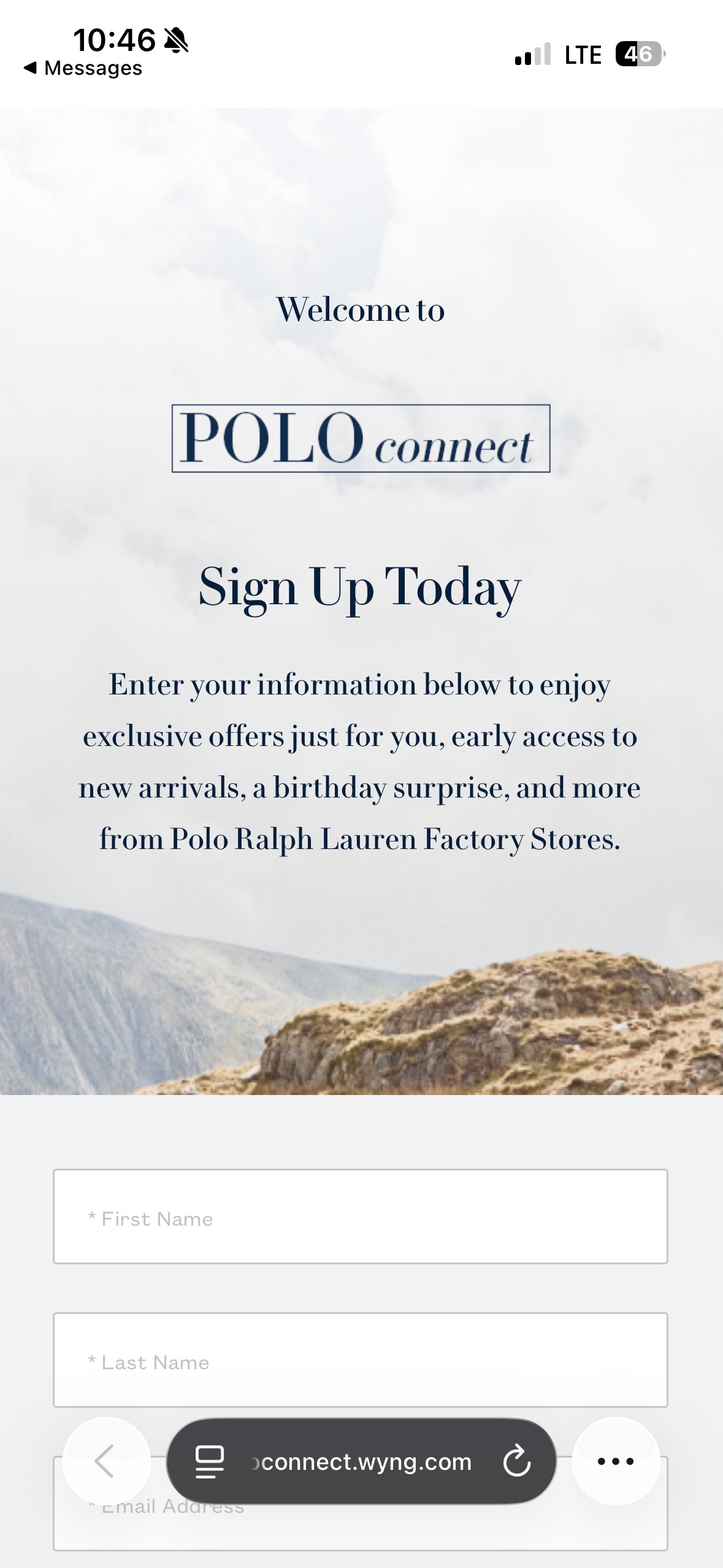
1. Excessive & Unclear Steps
- The sign-up process contains too many steps, many of which are not clearly explained.
- Customers frequently expressed confusion about the sequence and what actions were required of them.
Impact: Drop-off during sign-up and frustration for users who expected a straightforward experience.
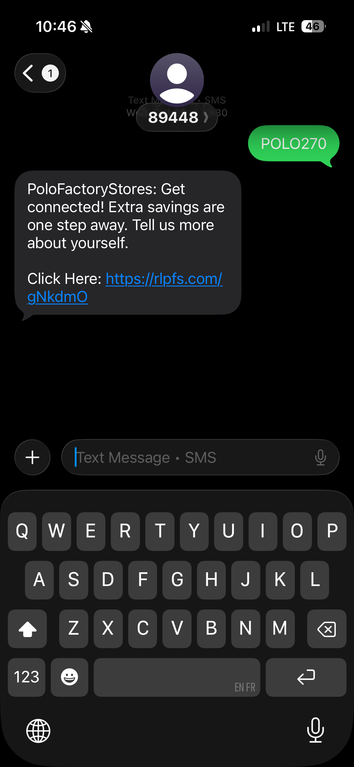
2. Link Overload in Instructions
- The instructional text includes multiple links, which customers tended to click on every time one appeared.
- This behavior pulled users out of the intended flow, as they expected each link to be an action step.
Impact: Misleading navigation and increased task completion time.
3. Birthday Entry Format Issues
- The birthday field caused repeated errors due to unclear format requirements (e.g., MM/DD vs MM/DD/YYYY).
- Customers often had to re-enter their information, leading to delays and dissatisfaction.
Impact: Form errors eroded user trust in the sign-up process.
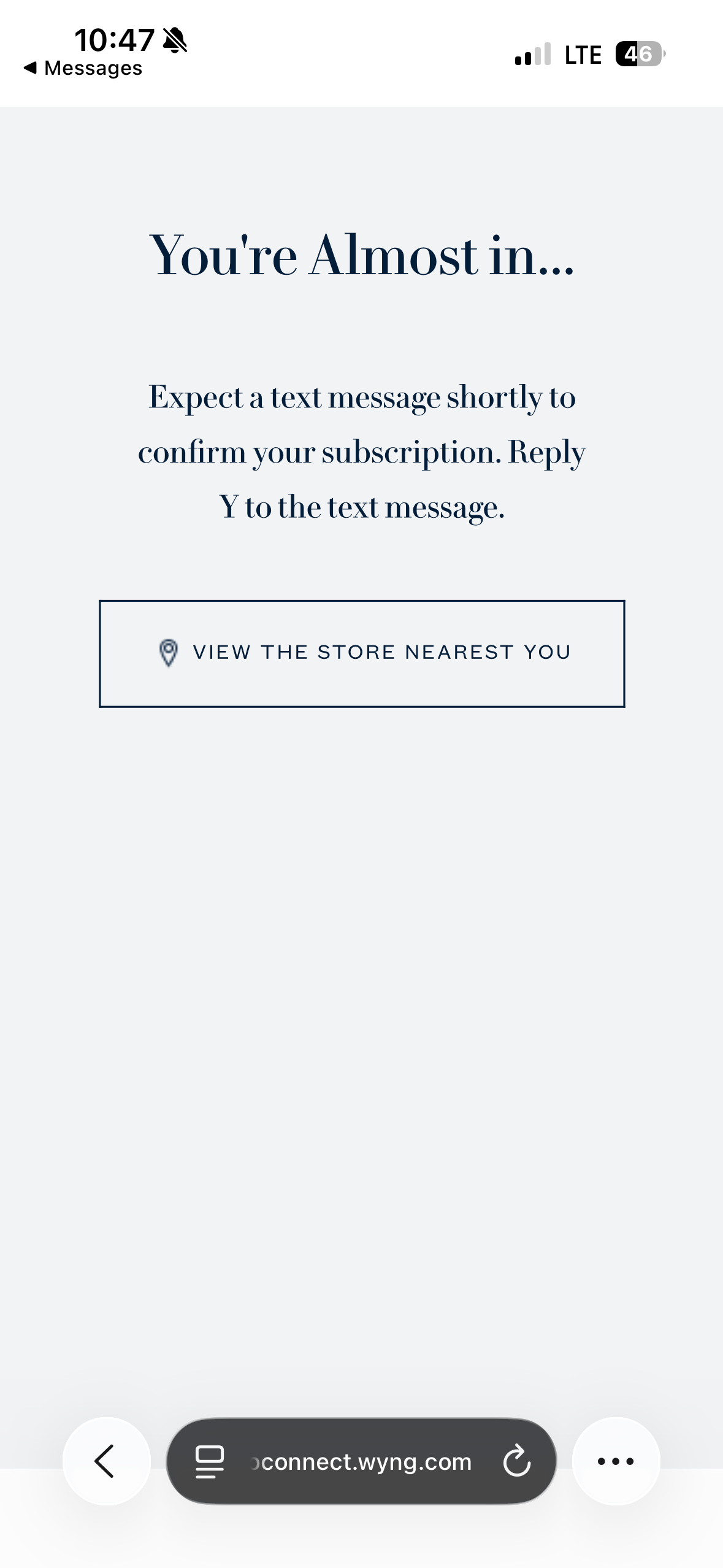
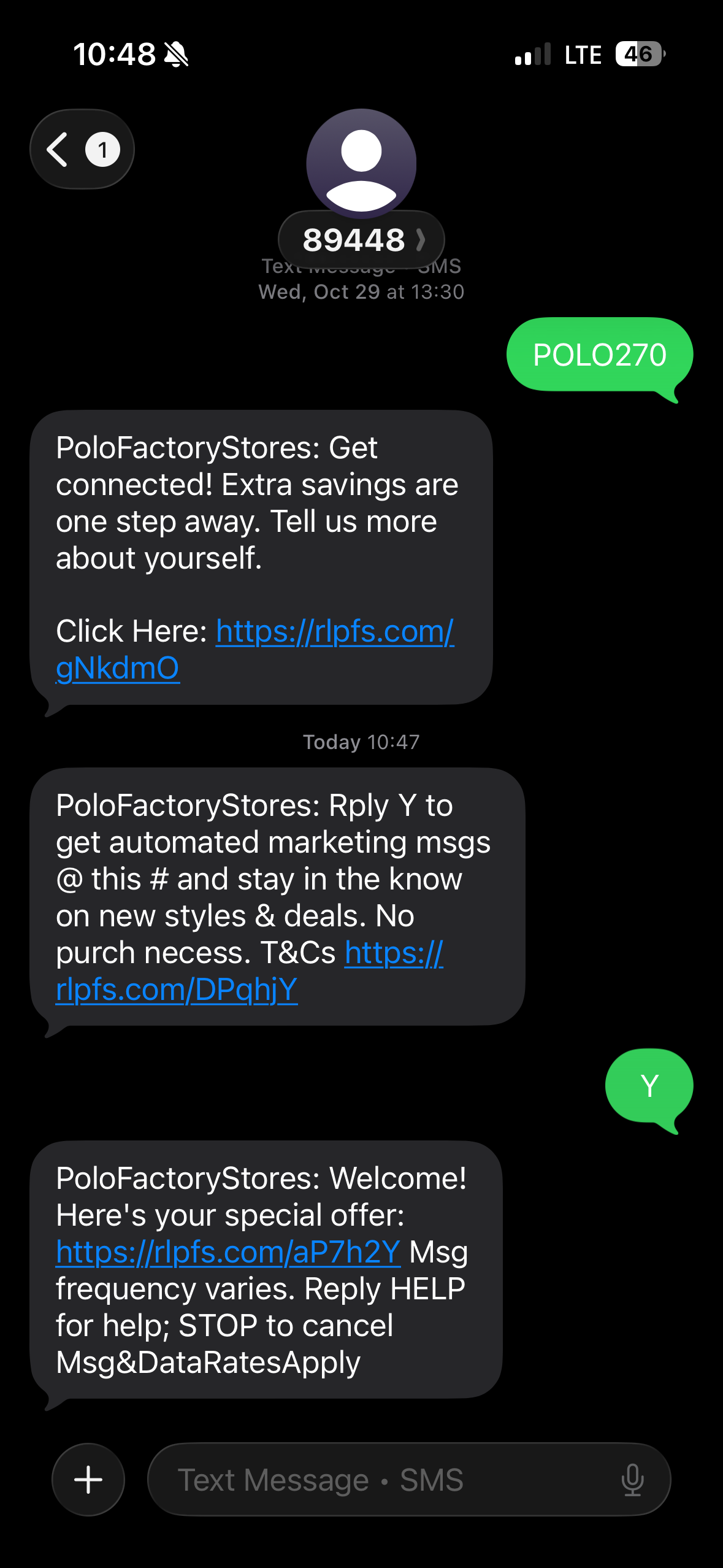
4. Confusing Post-Submission Experience
- After completing the form, users were directed to a “Locate Store” page, which implied they needed to take further action.
- In reality, users had to wait for a text message and reply to it to confirm their enrollment and receive their coupon.
Impact: Users were unsure if they had successfully signed up, creating uncertainty and unnecessary support questions.
Recommendations
Streamline the Process
- Reduce steps to essential fields only (name, email, birthday, zip code).
- Provide progress indicators for transparency.
Clarify Instructional Text
- Remove excessive links and replace them with concise, plain-language guidance.
- Use a single CTA (call-to-action) to prevent user distraction.
Fix the Birthday Input
- Use a date picker with clearly defined formatting instead of manual entry.
Redesign the Post-Submission Flow
- Replace the misleading “Locate Store” page with a confirmation screen that informs the user they will receive a text message.
- Provide clear expectations: “Look out for a text message and reply to confirm.”
Conclusion
The Polo Connect sign-up process has strong potential as a customer engagement tool, but the current design creates confusion, delays, and drop-off points. By simplifying form fields, clarifying copy, and aligning post-submission expectations, Polo Ralph Lauren can significantly improve customer experience and drive higher program adoption.